The Color Green
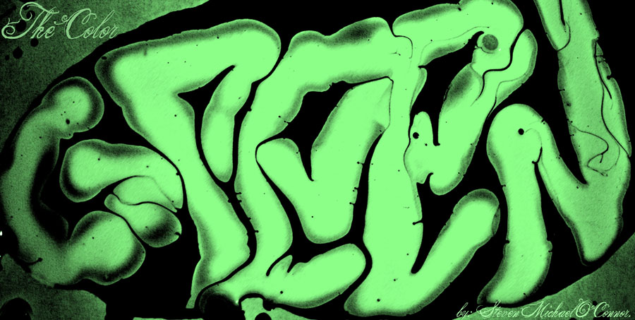
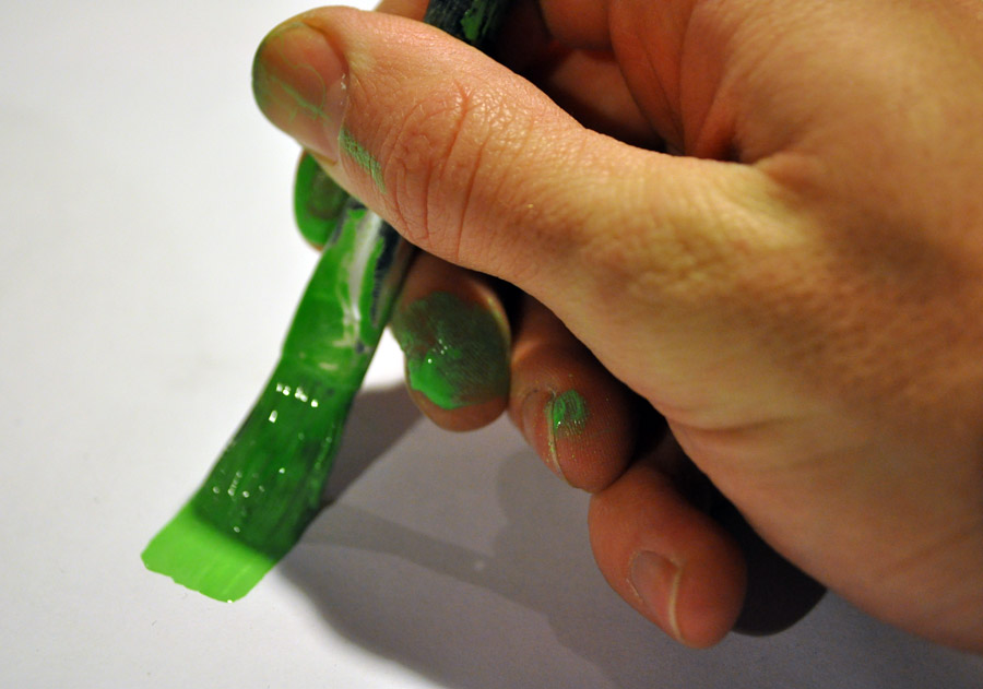
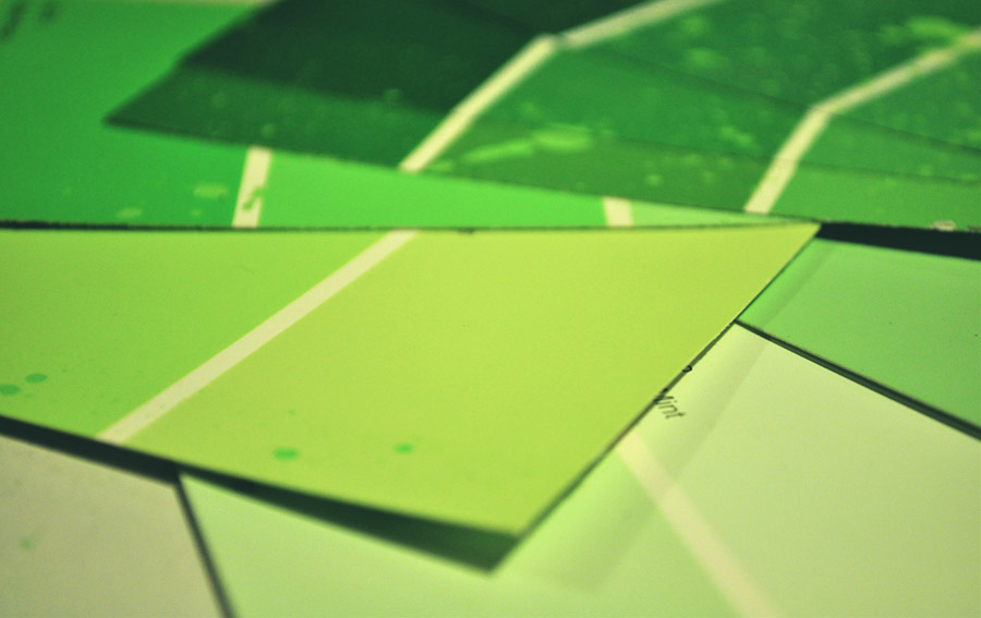
As a painter, I spend a great deal of time thinking about and working with colors. Figuring out which color is the appropriate vehicle for conveying a message/feeling is a very important part of my job. I try to learn about the color I’m working with, how they mix, how they go together…I’ve taken entire classes on the subject (color theory) based on pairing techniques and the psychology behind the appropriate usage for each one. Today I’d like to make the blog about one color, the color green, a color that I am at constant struggle with artistically and tend to avoid entirely.
The color green is a valuable tool used to promote environmental sustainability and it’s being used everywhere you look these days. Oddly enough though, this practice of using the pigment green connotes the very definition of irony—it is commonly the most toxic color of all paints/dyes available. The vast majority of people are completely unaware that green is typically one of the most toxic pigments in existence, making its use as a symbol for sustainability seem extremely counter-intuitive.
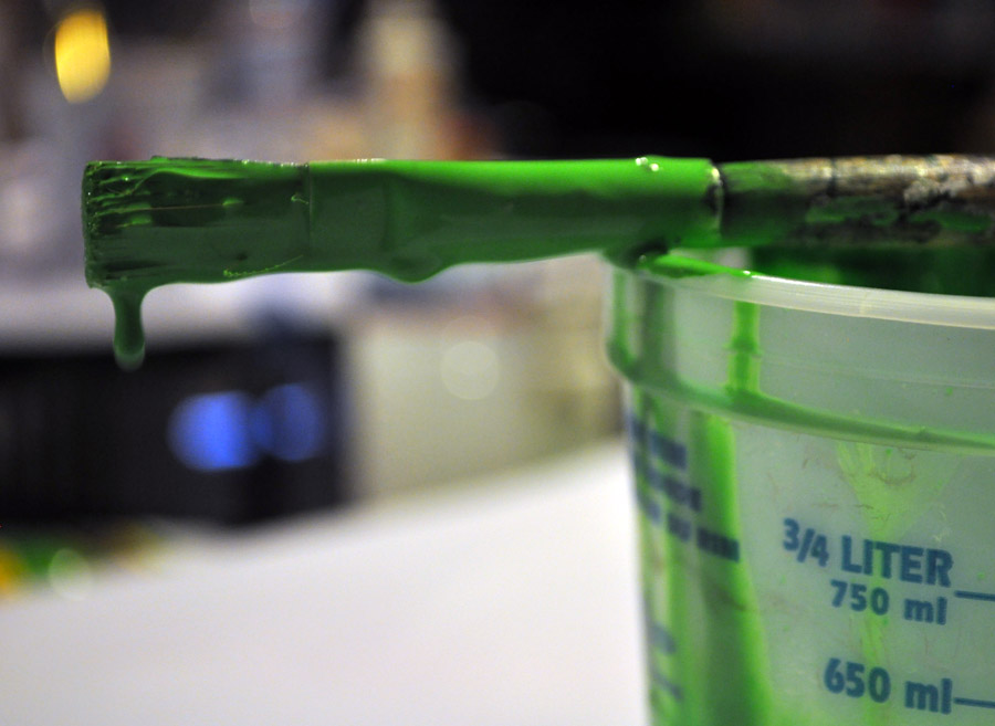
These days, the color green is more prevalent than ever—obviously due in part to the “Green Movement” and its association with environmental protection. The color green can be found just about anywhere you look, but using it seems to come with a cost attached. Its been implied that products with the color green in them can contaminate the recycling process creating a headache during the sorting process. Pigment 7, the most common pigment used in green paint, contains high amounts of chlorine which can result in cancer and birth defects. It’s really the combination of the colors blue & yellow that makes it so dense with injurious chemicals—what one color lacks in toxicity, the other makes up for. After I did a little online research I was surprised to find that there really aren’t that many safe, high quality alternatives to the popular paints/dyes in the color green. As an artist, I am working with paints and dyes of almost every medium on a daily basis, I know most of them are nasty, and keeping them off my skin is a constant struggle. According to a report by The World Health Organization: International Agency for Research on Cancer, my very occupation puts me at an increased risk of cancer of up to 20%, and risk of lung cancer of up to 40%…good talk.
It may sound like I’m picking on green (because I am), but in the spirit of fairness, I will concede that regardless of the pigment used, most paints are made of terrible stuff.
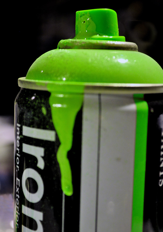
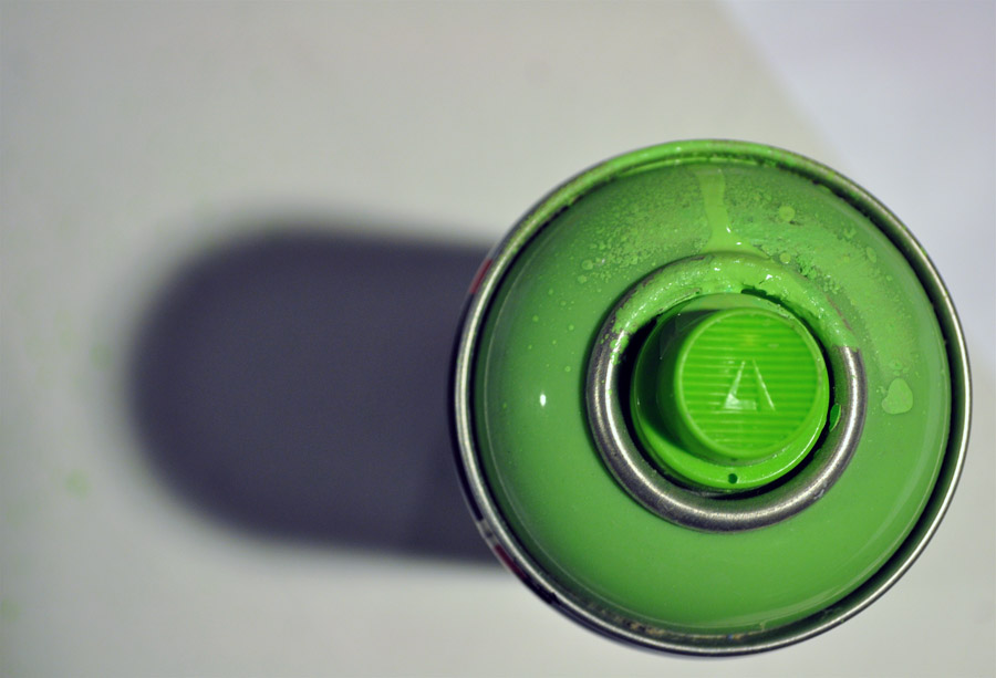
Before I delve more into color green and issues of our environment as related to art, let me first explain what is in latex paint—the type of paint that an average person would use. If you were to paint your kitchen green, would you know what was in that paint? Lets start with VOCs or volatile organic compounds. VOCs are found in traditional house paints. The amount and style of VOCs in house paint varies brand to brand, but most contain additional harmful stuff like toluene, formaldehyde, and even benzene. These things make you sick and can cause cancer. VOCs are volatile and as a result, the paint can release gas (known as “off-gas”) from the walls into the air—Bad. It increases exposure and has a slew of nasty health effects. So if you are painting, use water based latexes that are low VOC/no VOC, free of formaldehyde and other chemicals. And always paint in a well ventilated place, preferably with a mask on. This is important because as far as I understand it, even after your done painting your walls they are still “off gassing” nasty VOCs into the air. A good tip is flat finish paints tend to contain fewer VOCs than glossy finish paints, while pale or white paints have less VOCs than vibrantly colored or dark paints (such as the color green). There are some safe alternatives in existence—paints derived from chalk, lime, plant pigments, minerals and even citruses. ”Milk-based” paints give off no natural or man-made VOCs, but are unfortunately far less effective.
Bottom-line: the alternatives work, but not great. Here’s the breakdown, there are two types of latex paints out there: solvent-based paints and acrylic emulsions…better known as water-based paints. The better choice, overall, seems to be a high quality water-based paint because it has a better health benefit. Performance wise, they tend to be effective and have a much better environmental impact. Solvent-based paints are slightly dangerous, but more effective traditionally speaking. Breathing them in or absorbing through the skin can negatively affect the human body. All right that’s enough quasi chemistry from the artist.
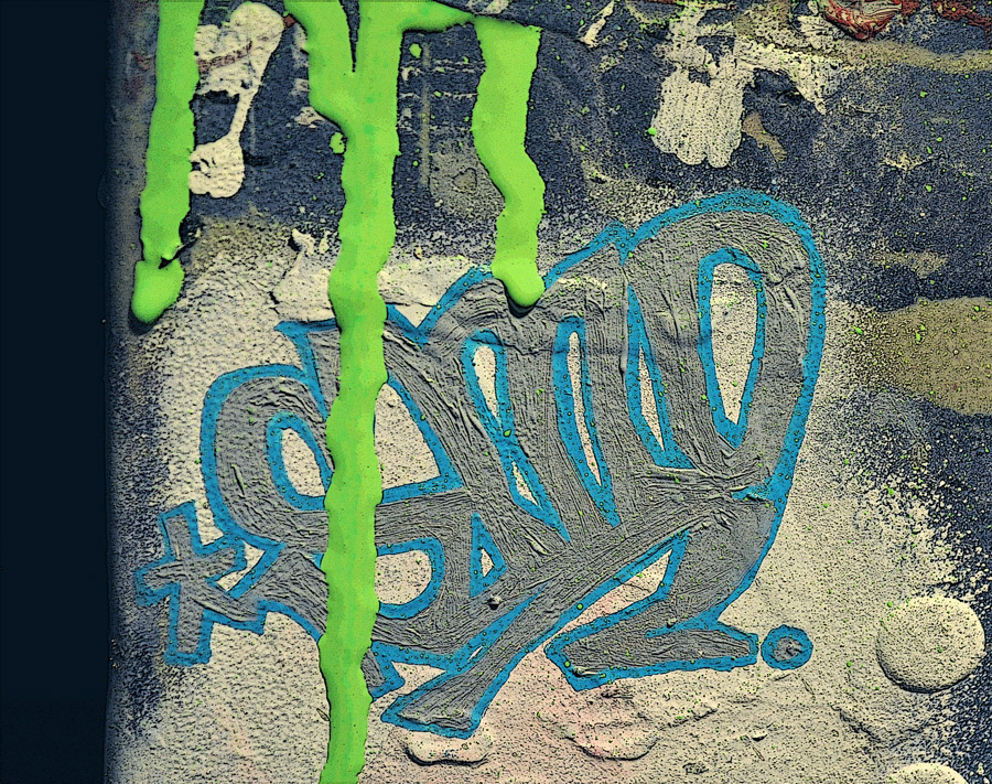
So what—you may be asking yourself—am I trying to say exactly? Green itself can never be green. The problem seems to be that our society has embraced the color green as a symbol of sustainability, but the ingredients used to make that very symbol are contaminating the World it represents. The fascinating thing about this phenomenon is just how green has been involved in disseminating contradictory messages. In some cultures, it represents life and in others death. It can invoke the majesty of nature, or just feel “institutional.”
Green has been the likely culprit behind the headaches of artists for centuries—both figuratively and literally. Green was known to burn right through the canvas if mixed wrong. It could also burn/irritate the skin of an artist if not washed off and was rumored to be used as a rat poison in Paris. It was the first color to fade and its high arsenic content “off gassed” VOCs that were most likely sickening to people who had it on their walls in the 18th and 19th centuries.
Fast foreword to the present. There is a new wave of “green washing” these days—businesses may reap financial rewards for environmentally friendly actions. A great example of green washing is when hotels ask their guests to save energy by turning off lights. Of course it’s better for the environment, but the hotel owners have a financial incentive in the form of a lower electric bill. In our culture, it has become in-vogue to be environmentally conscious. It’s popular to go “green” these days. The environment is finally on peoples’ minds alongside tangible ways that we can make personal improvements. As the masses clamor for environmental change, green paint seems to be a counterintuitive symbol. Pigment Green 50 is titanium, nickel & colbalt…more metal then color. Pigment 36 is not any better; its bromide atoms in combination with chlorine are nothing short of toxic. So with all of this evidence, why is the color green our flag for sustainability?
I asked a man who knows about sustainability, because he lives it. Sergio Scabuzzo, is an environmental blogger and sustainability enthusiast. I asked him to weigh in on the topic of ‘green’ and its impact, both positive and negative. I also wanted to know as an artist, if there were any changes that I could make to environmentally improve my studio/business. My environmental knowledge is admittedly limited.
See our conversation below…
SMO: Did you know about the color green’s toxicity?
Sergio: Yes, I read a post on the Huffington Post about the toxicity levels of the color green, what about you?
SMO: I read this dope article in the NYT by ALICE RAWSTHORN a couple years back that made me want to look into this topic for my own blog in case other artists missed it and because of the contradictory history that green has had already.
So knowing that it’s toxic…does that change anything for you?
Sergio: The color green is just the façade or represents sprouts (it’s the newest part of a plant). It’s ironic, but really what we need to hold onto is the idea, not the actual color. You can paint a building green, but it won’t be “green.”
SMO: Do you think there is a way to replace the color green as a symbol of sustainability?
Sergio: Personally, I doubt that would even be beneficial. It’s not that green is bad— green is beautiful; the problem is our emulation of what it is…
SMO: People have known how nasty green was for a very long time, it would literally burn through the canvas, so why do you think they chose green as the symbol of sustainability?
Sergio: The answer is because trees, grass, and most fresh plant life starts off green. Maybe for every green sign we paint, we should plant a tree.
SMO: So what your saying is that our representation of the color green is flawed, but through no fault of anyone?
Sergio: So what we need to do is hang onto the idea of it, you don’t need to paint your car green you need to make it “green.”
SMO: If you had to choose an alt color to represent sustainability, what would it be?
Sergio: Blue clear water, clear sky
SMO: What is the most important tip you could give an artist to making the process more eco friendly?
Sergio: Try using recycled objects (precylced) reuse materials as much as possible, and try eco friendly paints and or supplies.
SMO: Since you are the first guest on my blog, and I’m a starving artist, all that I can offer in return is exposure to my limited audience. What’s your blog and do you want to plug anything that my readers may want to check out?
Sergio: www.thegreenmanproject.com is the website. My whole thing is anything related to the transition movement or permaculture.
SMO: I know one thing…after all this research I’m going to be bringing some houseplants into my studio and tightening up my mask the next time I work with green. We all need to minimize our carbon footprint and provide a safe, non-toxic environment for future generations. So if painting a few signs in a toxic color helps get the message out, then I think it’s worth the risk.

